
2026
Doctronic AI
UX & Product Audit of an AI Healthcare Platform, 12 Verified Issues, 3-Phase Roadmap, Measurable Impact
AI Healthcare
UX Audit
Product Strategy
Context
Doctronic.ai operates at the intersection of generative AI and healthcare. The product is genuinely strong: 22.8M+ consultations, HIPAA compliance, LegitScript certification, licensed doctors in all 50 states, a content library spanning 560+ blog pages, and a compelling $39 telehealth handoff to human physicians.
The testimonial evidence alone is extraordinary, hundreds of detailed patient stories describing life-saving diagnoses, anxiety relief, and first-time comfort with medical conversations.
I conducted an independent UX and product audit of the platform, reviewing 16 pages of the live site across logged-in and logged-out states, cross-referencing against Trustpilot data, public resources, and core user flows.
Role
UX/Product Auditor
Scope
16 pages audited across logged-in and logged-out states
Tools
Live site analysis, Trustpilot, structured severity matrix
Deliverable
Comprehensive audit report with 12 verified issues and 3-phase roadmap
Context

The Core Thesis
The audit revealed one central problem:

“The gap between Doctronic’s product capability and its website experience is where trust goes to die.”
The underlying product is strong. But the website systematically buries its strongest trust assets, creates friction at the highest-revenue conversion points, and introduces cognitive dissonance through conflicting messaging.
Trust is the conversion currency in healthcare, and it is currently being spent before it is ever earned
The Core Thesis
How I Audited It
This wasn’t a surface-level review. I systematically analyzed 16 pages of the live Doctronic.ai website across both user states:
0
0
6 Pages audited across logged-in and logged-out states
0
0
12 Verified issues identified and severity-ranked
0
0
3 Implementation phases prioritized by business impact
Every finding was cross-referenced against the live production site, Trustpilot review data, and the platform’s public resource center. Issues were severity-ranked using a weighted matrix: user impact × business impact × implementation complexity.
How I Audited It

Key Findings
The audit surfaced 12 verified issues across critical, high, and medium severity. Here are the five most impactful:
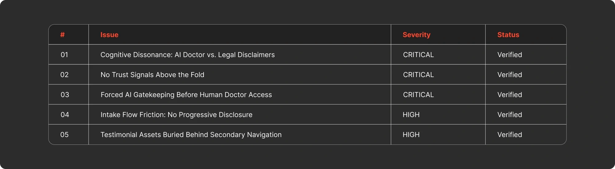
The Trust Paradox
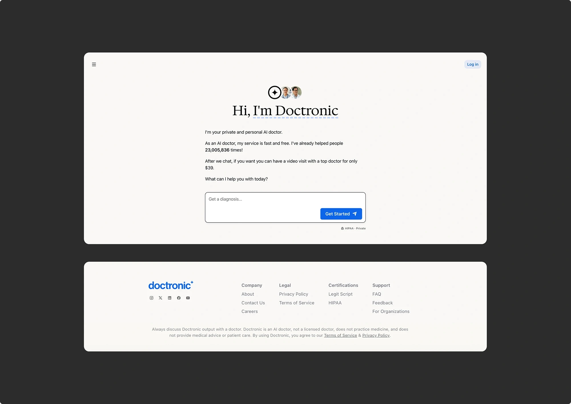
The problem: The platform brands itself as “your AI doctor” throughout the hero, navigation, and chat UI. Simultaneously, the footer on every page repeats: “Doctronic is not a doctor, does not provide medical advice, does not practice medicine.” The product sets the mental model of a doctor, then legally destroys it before the user engages.
Why it matters: In healthcare, trust is the conversion currency. This contradiction spends it before it’s earned. Users who notice the clash will hesitate to share sensitive health information, the exact action the product needs them to take.
The fix: Rebrand the AI persona from “AI Doctor” to “AI Medical Assistant.” Consolidate disclaimers into a single disclosure below the chat input. Replace remaining disclaimer space with positive trust language.
Zero Trust Signals at the Point of Decision
The problem: The hero asks users to submit sensitive health information immediately, yet displays no credentials, no badges, no ratings, and no testimonials above the fold. Meanwhile, Doctronic has 100+ patient testimonials, HIPAA certification, LegitScript verification, and named doctors. All buried behind secondary navigation.
Why it matters: Telemedicine studies show 15–30% improvement in sign-up intent when trust signals are visible before the decision point. Doctronic has the assets, they’re just invisible when they matter most.
The fix: Surface a social proof strip above the chat input: “22.8M+ consults · Rated on Trustpilot · Licensed doctors in all 50 states.” Move badges into the hero. Embed 3–4 testimonials inline on the homepage.

The $39 Revenue Gate
The problem: Users who want to book a $39 video visit with a human doctor are forced to complete a full AI consultation first. No bypass option exists. For a user in pain or wanting a prescription refill, this artificial gate blocks the highest-revenue action.
Why it matters: High-intent buyers, the users most likely to pay, are the ones most frustrated by forced AI gatekeeping. Estimated 15–25% abandon before reaching payment.
The fix: Add a visible “Skip to Human Doctor” option. Encourage the free AI step gently: “Chatting with our AI first is free and speeds up your visit. Skip to doctor anyway?”

Blank-Page Anxiety in the Intake Flow
The problem: All consultation entry points present a single text input with “Get Started” and no guidance. Users must formulate their own medical query from scratch. No suggestion chips, no intent-based pathways, no progressive disclosure.
Why it matters: A blank input in a medical context creates heightened anxiety. Every user who bounces here is lost before the product demonstrates any value.
The fix: Add suggestion chips: “Prescription Refill,” “Skin Issue,” “Cold / Flu,” “Anxiety / Mental Health.” Typically drives 10–20% improvement in consultation completion.

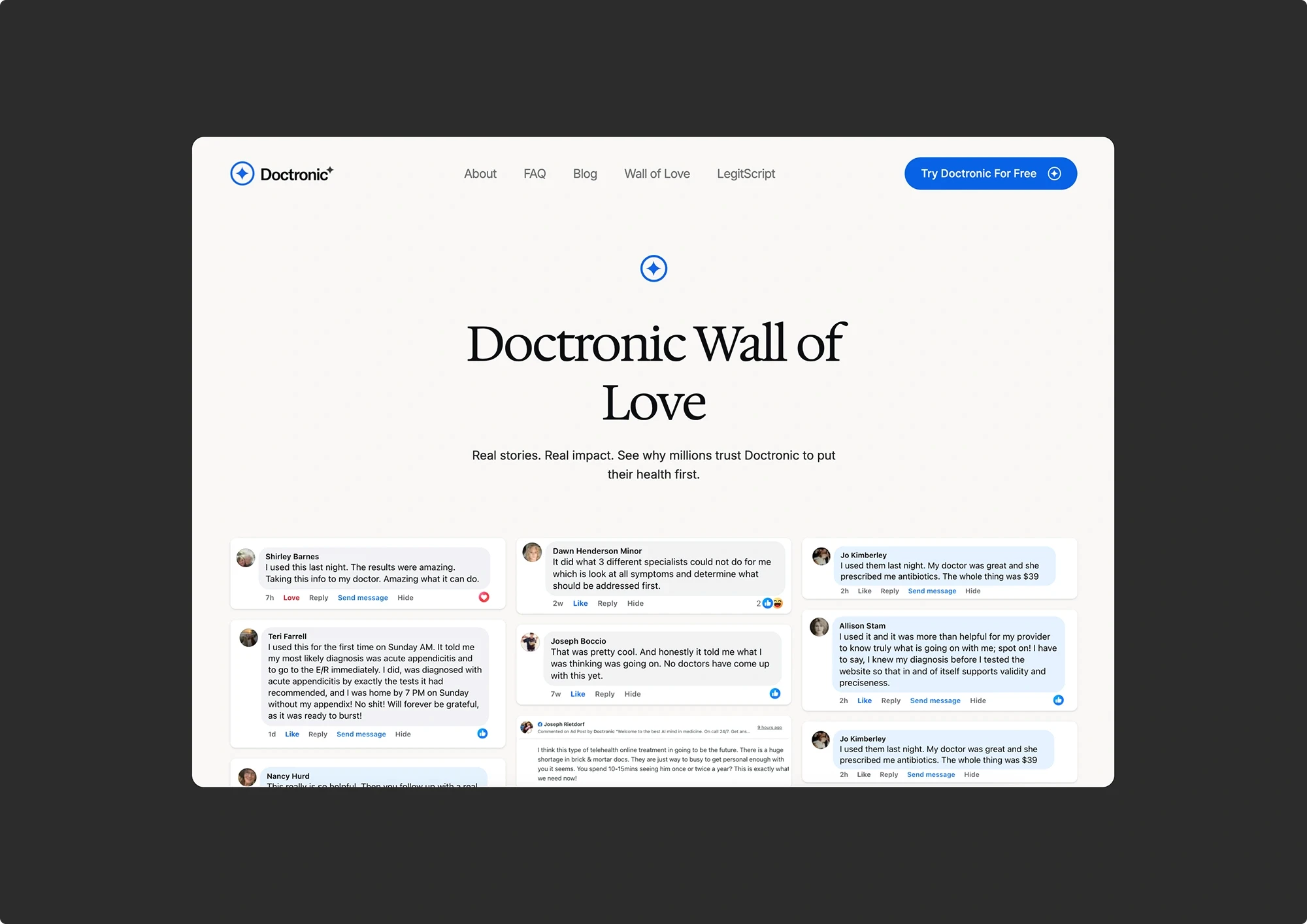
100+ Testimonials Nobody Sees
The problem: Doctronic has one of the most compelling testimonial libraries in telehealth, over 100 detailed patient stories. They’re buried behind a nested dropdown under “Wall of Love.” The homepage surfaces only 3 - 4 truncated stories.
Why it matters: This is potentially the single highest-ROI fix available. The testimonials are exceptional, detailed, emotional, credible. They’re conversion assets sitting in a drawer.
The fix: Surface 4-6 testimonials inline on the homepage at trust-anxiety peaks: before the chat input, after the AI explanation, and near the $39 doctor mention.
Key Findings
Implementation Roadmap
Every recommendation was prioritized by business impact and implementation effort:
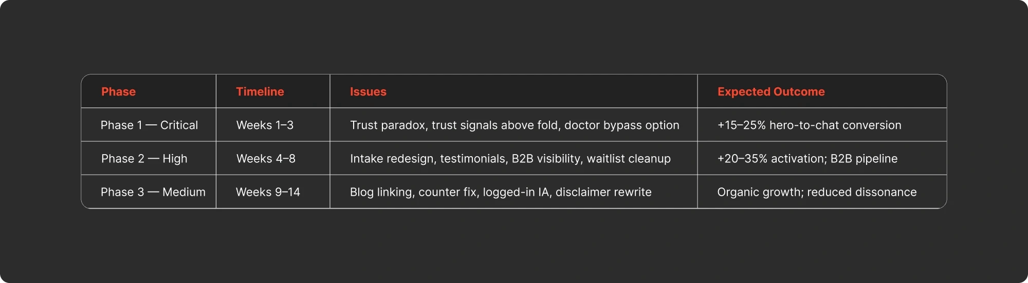
Recommended Immediate Actions
1
A/B test a “Skip to Human Doctor” flow
2
Surface trust badges and 3–4 testimonials above the fold
3
Add suggestion chips to the intake input
Implementation Roadmap
The First-Session Success Lens
Every finding in this audit traces back to one principle:
“Can a user understand what this product does, trust it with their information, and experience value — all within their first interaction?”
Doctronic’s product delivers genuine value, 22.8M consultations prove that. But the website fails the first-session test at multiple points: trust is undermined before it’s earned, value is gated behind friction, and the platform’s strongest proof points are invisible to first-time visitors.
The fix isn’t a redesign. It’s a resequencing, showing the right information at the right moment so first-time users feel safe enough to engage.
The First-Session Success Lens
Key Takeaways
Key Takeaways
1
Strong products can have weak experiences.
Doctronic’s AI engine, doctor network, and patient outcomes are genuinely impressive. None of that matters if the website doesn’t communicate it before asking users to share their health data.
2
Trust assets only work if users can find them.
100+ testimonials, HIPAA certification, LegitScript verification, named doctors, all buried. The highest-leverage fix is often not creating something new, but surfacing what already exists.
3
AI healthcare has a unique conversion problem.
Users are sharing the most sensitive information they have — their health — with a machine. The bar for trust is higher than any other category. Every UX decision either builds or erodes it.
4
An audit is a design tool, not a critique.
This wasn’t about finding flaws. It was about identifying the gap between a strong product and its experience, then building a prioritized roadmap to close it.
Final Thought
Doctronic has the foundations of a genuinely differentiated product. The gap between that capability and the current experience is entirely addressable. Make first-time visitors feel safe before asking them to share their health information. Every recommendation in this audit serves that goal.
Key Takeaways
More Works
(GQ® — 02)
©2026


2026
Doctronic AI
UX & Product Audit of an AI Healthcare Platform, 12 Verified Issues, 3-Phase Roadmap, Measurable Impact
AI Healthcare
UX Audit
Product Strategy
Context
Doctronic.ai operates at the intersection of generative AI and healthcare. The product is genuinely strong: 22.8M+ consultations, HIPAA compliance, LegitScript certification, licensed doctors in all 50 states, a content library spanning 560+ blog pages, and a compelling $39 telehealth handoff to human physicians.
The testimonial evidence alone is extraordinary, hundreds of detailed patient stories describing life-saving diagnoses, anxiety relief, and first-time comfort with medical conversations.
I conducted an independent UX and product audit of the platform, reviewing 16 pages of the live site across logged-in and logged-out states, cross-referencing against Trustpilot data, public resources, and core user flows.
Role
UX/Product Auditor
Scope
16 pages audited across logged-in and logged-out states
Tools
Live site analysis, Trustpilot, structured severity matrix
Deliverable
Comprehensive audit report with 12 verified issues and 3-phase roadmap
Context
The Core Thesis
The audit revealed one central problem:
“The gap between Doctronic’s product capability and its website experience is where trust goes to die.”
The underlying product is strong. But the website systematically buries its strongest trust assets, creates friction at the highest-revenue conversion points, and introduces cognitive dissonance through conflicting messaging.
Trust is the conversion currency in healthcare, and it is currently being spent before it is ever earned
The Core Thesis
How I Audited It
This wasn’t a surface-level review. I systematically analyzed 16 pages of the live Doctronic.ai website across both user states:
0
0
6 Pages audited across logged-in and logged-out states
0
0
12 Verified issues identified and severity-ranked
0
0
3 Implementation phases prioritized by business impact
Every finding was cross-referenced against the live production site, Trustpilot review data, and the platform’s public resource center. Issues were severity-ranked using a weighted matrix: user impact × business impact × implementation complexity.
How I Audited It
Key Findings
The audit surfaced 12 verified issues across critical, high, and medium severity. Here are the five most impactful:
The Trust Paradox
The problem: The platform brands itself as “your AI doctor” throughout the hero, navigation, and chat UI. Simultaneously, the footer on every page repeats: “Doctronic is not a doctor, does not provide medical advice, does not practice medicine.” The product sets the mental model of a doctor, then legally destroys it before the user engages.
Why it matters: In healthcare, trust is the conversion currency. This contradiction spends it before it’s earned. Users who notice the clash will hesitate to share sensitive health information, the exact action the product needs them to take.
The fix: Rebrand the AI persona from “AI Doctor” to “AI Medical Assistant.” Consolidate disclaimers into a single disclosure below the chat input. Replace remaining disclaimer space with positive trust language.
Zero Trust Signals at the Point of Decision
The problem: The hero asks users to submit sensitive health information immediately, yet displays no credentials, no badges, no ratings, and no testimonials above the fold. Meanwhile, Doctronic has 100+ patient testimonials, HIPAA certification, LegitScript verification, and named doctors. All buried behind secondary navigation.
Why it matters: Telemedicine studies show 15–30% improvement in sign-up intent when trust signals are visible before the decision point. Doctronic has the assets, they’re just invisible when they matter most.
The fix: Surface a social proof strip above the chat input: “22.8M+ consults · Rated on Trustpilot · Licensed doctors in all 50 states.” Move badges into the hero. Embed 3–4 testimonials inline on the homepage.
The $39 Revenue Gate
The problem: Users who want to book a $39 video visit with a human doctor are forced to complete a full AI consultation first. No bypass option exists. For a user in pain or wanting a prescription refill, this artificial gate blocks the highest-revenue action.
Why it matters: High-intent buyers, the users most likely to pay, are the ones most frustrated by forced AI gatekeeping. Estimated 15–25% abandon before reaching payment.
The fix: Add a visible “Skip to Human Doctor” option. Encourage the free AI step gently: “Chatting with our AI first is free and speeds up your visit. Skip to doctor anyway?”
Blank-Page Anxiety in the Intake Flow
The problem: All consultation entry points present a single text input with “Get Started” and no guidance. Users must formulate their own medical query from scratch. No suggestion chips, no intent-based pathways, no progressive disclosure.
Why it matters: A blank input in a medical context creates heightened anxiety. Every user who bounces here is lost before the product demonstrates any value.
The fix: Add suggestion chips: “Prescription Refill,” “Skin Issue,” “Cold / Flu,” “Anxiety / Mental Health.” Typically drives 10–20% improvement in consultation completion.
100+ Testimonials Nobody Sees
The problem: Doctronic has one of the most compelling testimonial libraries in telehealth, over 100 detailed patient stories. They’re buried behind a nested dropdown under “Wall of Love.” The homepage surfaces only 3 - 4 truncated stories.
Why it matters: This is potentially the single highest-ROI fix available. The testimonials are exceptional, detailed, emotional, credible. They’re conversion assets sitting in a drawer.
The fix: Surface 4-6 testimonials inline on the homepage at trust-anxiety peaks: before the chat input, after the AI explanation, and near the $39 doctor mention.
Key Findings
Implementation Roadmap
Every recommendation was prioritized by business impact and implementation effort:
Recommended Immediate Actions
1
A/B test a “Skip to Human Doctor” flow
2
Surface trust badges and 3–4 testimonials above the fold
3
Add suggestion chips to the intake input
Implementation Roadmap
The First-Session Success Lens
Every finding in this audit traces back to one principle:
“Can a user understand what this product does, trust it with their information, and experience value — all within their first interaction?”
Doctronic’s product delivers genuine value, 22.8M consultations prove that. But the website fails the first-session test at multiple points: trust is undermined before it’s earned, value is gated behind friction, and the platform’s strongest proof points are invisible to first-time visitors.
The fix isn’t a redesign. It’s a resequencing, showing the right information at the right moment so first-time users feel safe enough to engage.
The First-Session Success Lens
Key Takeaways
Key Takeaways
1
Strong products can have weak experiences.
Doctronic’s AI engine, doctor network, and patient outcomes are genuinely impressive. None of that matters if the website doesn’t communicate it before asking users to share their health data.
2
Trust assets only work if users can find them.
100+ testimonials, HIPAA certification, LegitScript verification, named doctors, all buried. The highest-leverage fix is often not creating something new, but surfacing what already exists.
3
AI healthcare has a unique conversion problem.
Users are sharing the most sensitive information they have — their health — with a machine. The bar for trust is higher than any other category. Every UX decision either builds or erodes it.
4
An audit is a design tool, not a critique.
This wasn’t about finding flaws. It was about identifying the gap between a strong product and its experience, then building a prioritized roadmap to close it.
Final Thought
Doctronic has the foundations of a genuinely differentiated product. The gap between that capability and the current experience is entirely addressable. Make first-time visitors feel safe before asking them to share their health information. Every recommendation in this audit serves that goal.
Key Takeaways
More Works
(GQ® — 02)
©2026
2026
Doctronic AI
UX & Product Audit of an AI Healthcare Platform, 12 Verified Issues, 3-Phase Roadmap, Measurable Impact
AI Healthcare
UX Audit
Product Strategy
Context
Doctronic.ai operates at the intersection of generative AI and healthcare. The product is genuinely strong: 22.8M+ consultations, HIPAA compliance, LegitScript certification, licensed doctors in all 50 states, a content library spanning 560+ blog pages, and a compelling $39 telehealth handoff to human physicians.
The testimonial evidence alone is extraordinary, hundreds of detailed patient stories describing life-saving diagnoses, anxiety relief, and first-time comfort with medical conversations.
I conducted an independent UX and product audit of the platform, reviewing 16 pages of the live site across logged-in and logged-out states, cross-referencing against Trustpilot data, public resources, and core user flows.
Role
UX/Product Auditor
Scope
16 pages audited across logged-in and logged-out states
Tools
Live site analysis, Trustpilot, structured severity matrix
Deliverable
Comprehensive audit report with 12 verified issues and 3-phase roadmap
Context
The Core Thesis
The audit revealed one central problem:
“The gap between Doctronic’s product capability and its website experience is where trust goes to die.”
The underlying product is strong. But the website systematically buries its strongest trust assets, creates friction at the highest-revenue conversion points, and introduces cognitive dissonance through conflicting messaging.
Trust is the conversion currency in healthcare, and it is currently being spent before it is ever earned
The Core Thesis
How I Audited It
This wasn’t a surface-level review. I systematically analyzed 16 pages of the live Doctronic.ai website across both user states:
0
0
6 Pages audited across logged-in and logged-out states
0
0
12 Verified issues identified and severity-ranked
0
0
3 Implementation phases prioritized by business impact
Every finding was cross-referenced against the live production site, Trustpilot review data, and the platform’s public resource center. Issues were severity-ranked using a weighted matrix: user impact × business impact × implementation complexity.
How I Audited It
Key Findings
The audit surfaced 12 verified issues across critical, high, and medium severity. Here are the five most impactful:
The Trust Paradox
The problem: The platform brands itself as “your AI doctor” throughout the hero, navigation, and chat UI. Simultaneously, the footer on every page repeats: “Doctronic is not a doctor, does not provide medical advice, does not practice medicine.” The product sets the mental model of a doctor, then legally destroys it before the user engages.
Why it matters: In healthcare, trust is the conversion currency. This contradiction spends it before it’s earned. Users who notice the clash will hesitate to share sensitive health information, the exact action the product needs them to take.
The fix: Rebrand the AI persona from “AI Doctor” to “AI Medical Assistant.” Consolidate disclaimers into a single disclosure below the chat input. Replace remaining disclaimer space with positive trust language.
Zero Trust Signals at the Point of Decision
The problem: The hero asks users to submit sensitive health information immediately, yet displays no credentials, no badges, no ratings, and no testimonials above the fold. Meanwhile, Doctronic has 100+ patient testimonials, HIPAA certification, LegitScript verification, and named doctors. All buried behind secondary navigation.
Why it matters: Telemedicine studies show 15–30% improvement in sign-up intent when trust signals are visible before the decision point. Doctronic has the assets, they’re just invisible when they matter most.
The fix: Surface a social proof strip above the chat input: “22.8M+ consults · Rated on Trustpilot · Licensed doctors in all 50 states.” Move badges into the hero. Embed 3–4 testimonials inline on the homepage.
The $39 Revenue Gate
The problem: Users who want to book a $39 video visit with a human doctor are forced to complete a full AI consultation first. No bypass option exists. For a user in pain or wanting a prescription refill, this artificial gate blocks the highest-revenue action.
Why it matters: High-intent buyers, the users most likely to pay, are the ones most frustrated by forced AI gatekeeping. Estimated 15–25% abandon before reaching payment.
The fix: Add a visible “Skip to Human Doctor” option. Encourage the free AI step gently: “Chatting with our AI first is free and speeds up your visit. Skip to doctor anyway?”
Blank-Page Anxiety in the Intake Flow
The problem: All consultation entry points present a single text input with “Get Started” and no guidance. Users must formulate their own medical query from scratch. No suggestion chips, no intent-based pathways, no progressive disclosure.
Why it matters: A blank input in a medical context creates heightened anxiety. Every user who bounces here is lost before the product demonstrates any value.
The fix: Add suggestion chips: “Prescription Refill,” “Skin Issue,” “Cold / Flu,” “Anxiety / Mental Health.” Typically drives 10–20% improvement in consultation completion.
100+ Testimonials Nobody Sees
The problem: Doctronic has one of the most compelling testimonial libraries in telehealth, over 100 detailed patient stories. They’re buried behind a nested dropdown under “Wall of Love.” The homepage surfaces only 3 - 4 truncated stories.
Why it matters: This is potentially the single highest-ROI fix available. The testimonials are exceptional, detailed, emotional, credible. They’re conversion assets sitting in a drawer.
The fix: Surface 4-6 testimonials inline on the homepage at trust-anxiety peaks: before the chat input, after the AI explanation, and near the $39 doctor mention.
Key Findings
Implementation Roadmap
Every recommendation was prioritized by business impact and implementation effort:
Recommended Immediate Actions
1
A/B test a “Skip to Human Doctor” flow
2
Surface trust badges and 3–4 testimonials above the fold
3
Add suggestion chips to the intake input
Implementation Roadmap
The First-Session Success Lens
Every finding in this audit traces back to one principle:
“Can a user understand what this product does, trust it with their information, and experience value — all within their first interaction?”
Doctronic’s product delivers genuine value, 22.8M consultations prove that. But the website fails the first-session test at multiple points: trust is undermined before it’s earned, value is gated behind friction, and the platform’s strongest proof points are invisible to first-time visitors.
The fix isn’t a redesign. It’s a resequencing, showing the right information at the right moment so first-time users feel safe enough to engage.
The First-Session Success Lens
Key Takeaways
Key Takeaways
1
Strong products can have weak experiences.
Doctronic’s AI engine, doctor network, and patient outcomes are genuinely impressive. None of that matters if the website doesn’t communicate it before asking users to share their health data.
2
Trust assets only work if users can find them.
100+ testimonials, HIPAA certification, LegitScript verification, named doctors, all buried. The highest-leverage fix is often not creating something new, but surfacing what already exists.
3
AI healthcare has a unique conversion problem.
Users are sharing the most sensitive information they have — their health — with a machine. The bar for trust is higher than any other category. Every UX decision either builds or erodes it.
4
An audit is a design tool, not a critique.
This wasn’t about finding flaws. It was about identifying the gap between a strong product and its experience, then building a prioritized roadmap to close it.
Final Thought
Doctronic has the foundations of a genuinely differentiated product. The gap between that capability and the current experience is entirely addressable. Make first-time visitors feel safe before asking them to share their health information. Every recommendation in this audit serves that goal.
Key Takeaways
More Works
©2026