
2025
Rise Healthcare
How I redesigned a healthcare booking funnel and turned 50 monthly bookings into 300
Healthcare
Conversion Strategy
Mobile-First Redesign
Summary
Rise Health is a health and wellness clinic in Arizona with strong in-person credibility but a digital presence that couldn’t convert. 66% of their traffic was mobile, but mobile users were bouncing before they ever reached the booking page. Only 5.64% of all visitors made it to booking, and 1 in 5 who started the form abandoned it.
I was brought on to lead the redesign of their homepage and booking flow. Over 4 weeks, working with one developer and one marketing lead, I ran a research-driven, mobile-first redesign grounded in Google Analytics data, Hotjar heatmaps, and user interviews.
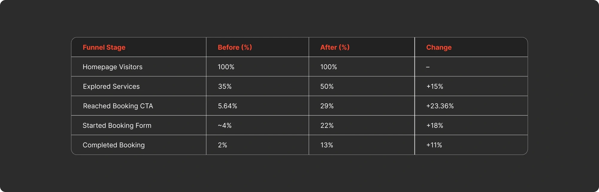
The result: completed bookings went from approximately 50 to 300 per month, a 6x increase, with a 29% reduction in form abandonment and a 24% increase in users reaching the booking page.
Role
Lead UX Designer
Tools
Figma
Google Analytics
Hotjar
Team
1 UX Designer
1 Developer
1 Marketing Lead
Duration
4 weeks
Work completed as part of the CreateApe design team. Some details have been simplified due to confidentiality agreements. All trademarks and data belong to their respective companies.

The Challenge
Rise Health’s existing digital presence struggled to convert visitors into booked appointments, especially on mobile. The homepage lacked clear messaging, trust-building elements, and action-oriented flows. Users landed, explored briefly, and left.
Despite a growing user base driven by organic search and social media, analytics and user testing revealed three critical friction points:
Mobile
Drop-Off
Mobile
Drop-Off
0%
0%
66% of traffic was mobile, but engagement time was 50% lower than desktop.
Form
Abandonment
Form
Abandonment
0%
0%
1 in 5 users abandoned the booking form before submission. Critical lead data was lost.
Booking
Page Friction
Booking
Page Friction
0%
0%
Only 5.64% of users landed on the booking page, and most bounced immediately.
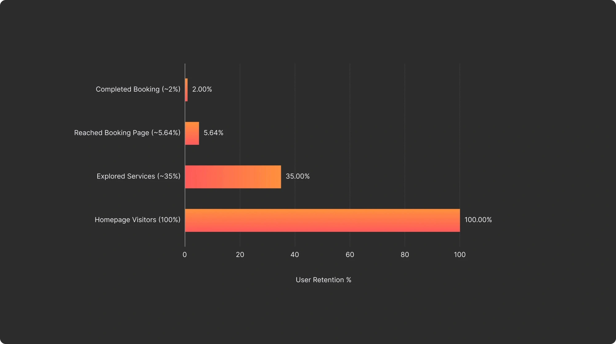
User Drop-Off Funnel on Rise Health Website

"It asked too much right away, I didn’t even finish the form."
— User Survey Response
For a local healthcare provider with strong in-person credibility, the website was not reflecting the same trust or value online, especially for first-time visitors. The business was paying to acquire traffic it couldn’t convert.
Our task was clear: redesign the digital experience to reduce drop-offs, build trust on first contact, and convert mobile users into booked clients.
The Challenge

Understanding the Users
Before jumping into solutions, I invested time understanding who we were designing for and why they were dropping off. Through demographic data, behavioral analytics, heatmap analysis, and user interviews, we surfaced four distinct user segments, each with their own motivations and friction points.
Research Overview
To uncover why users were dropping off, I ran mixed-method research combining Google Analytics behavioral data, Hotjar heatmaps and session recordings, and direct user interviews. This helped us identify who our key users were, how they engaged with the site, and where they experienced friction.
Key Personas (From Research)


Core User Segments (from Research)
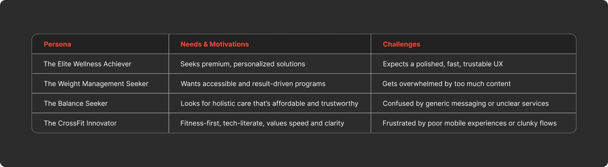
These personas and segments revealed overlapping motivations and pain points. But the most important finding wasn’t in any single data point, it was in the pattern across all of them.
Understanding the Users

The Strategic Reframe
The data pointed us toward one conclusion that reframed the entire project:
“This wasn’t a usability problem. It was a trust problem.”
Users could navigate the site. They could find the booking page. But they didn’t believe the experience was worth their personal information. The original site asked for commitment, name, phone number, health details, before it earned the right to ask
The heatmaps confirmed it: users scrolled past the hero, glanced at services, hovered over the booking CTA and left. They weren’t confused. They weren’t lost. They just weren’t convinced.
This insight changed our approach completely. We stopped trying to fix the funnel and started redesigning around a different question:
“How do we earn enough trust in the first 10 seconds that a user is willing to share their information?”
Every design decision that followed was an answer to that question. Trust signals before CTAs. Social proof before forms. Value before commitment. We called it first-session success: can a user understand what Rise Health offers, believe it’s credible, and take a meaningful action, all within a single visit?
The Strategic Reframe
Design Solutions
With the trust reframe as our lens, every design decision became a test: does this build trust before asking for commitment? Here are the four strategic moves that drove the results.
1
Trust-First Hero Redesign
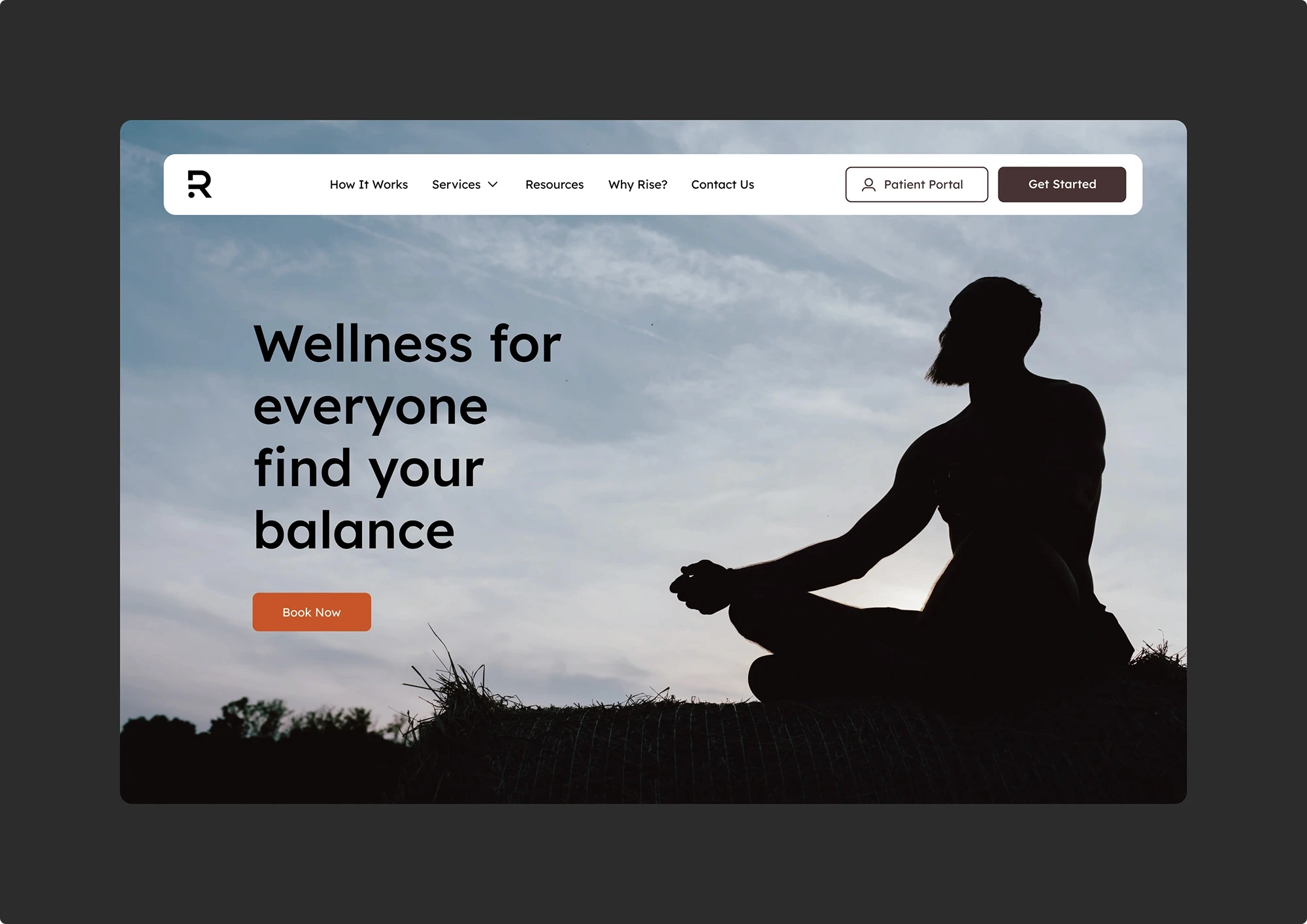
The problem: The original homepage opened with a generic stock image, a man meditating, and a vague headline: "Wellness for Everyone. Find Your Balance." No trust signals, no service clarity, no pricing, and no indication this was a real Arizona clinic. A single "Book Now" CTA asked for commitment before giving users any reason to commit. Heatmaps showed most mobile users never scrolled past this first viewport.
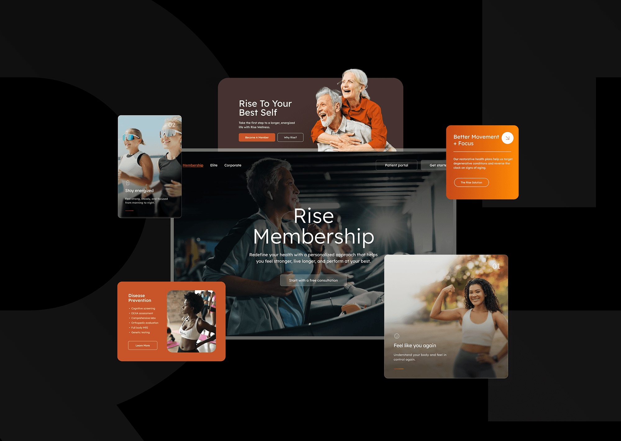
What I designed: A complete restructuring of the homepage narrative. The hero leads with a clear value proposition and a zero-commitment entry point: "Start with a free consultation." Below the fold, the page builds trust progressively, outcome-focused benefit cards replace the generic service list, real patient testimonials with full names are surfaced mid-page, transparent pricing is presented before the user has to ask, and a 4-step journey map demystifies the process. The entire page answers the user's questions in the order they naturally ask them: What is this? → Is it credible? → What will it cost? → How do I start?
Why this approach: I considered compressing all trust signals above the fold, ratings, testimonials, badges, but testing showed healthcare users don't make snap decisions from a single viewport. Cramming everything above the fold would create overload at the exact moment we needed calm and clarity. Instead, I structured the page as a progressive trust narrative where each scroll depth answers the next logical question, building confidence until the user is ready to act.
Before
After

2
Intent-Based Service Navigation
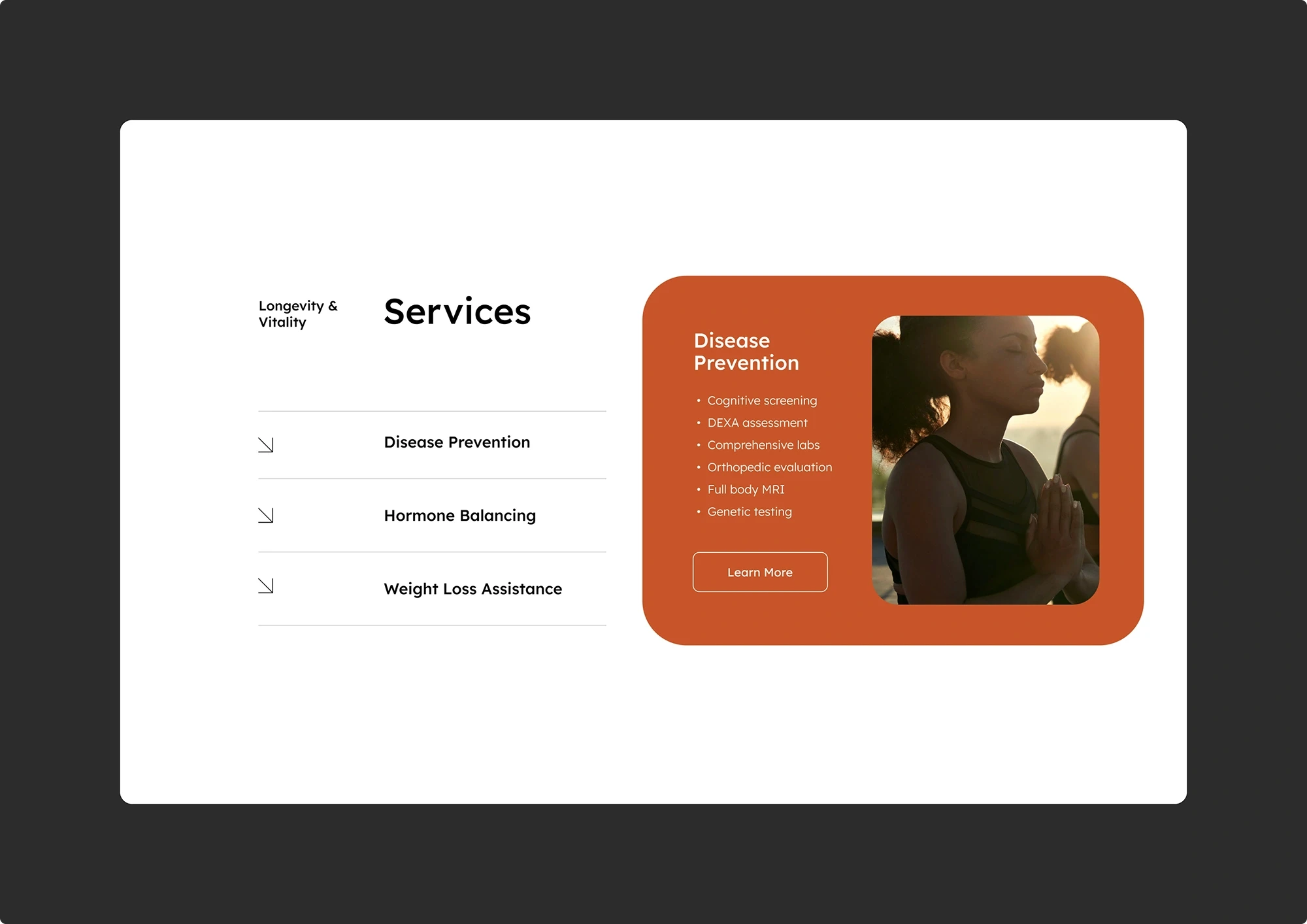
The problem: The original services section used an accordion-style layout, users had to click each category (Disease Prevention, Hormone Balancing, Weight Loss Assistance) to reveal sub-services one at a time. Users could never scan or compare across services. Analytics showed users who clicked into 3+ dropdowns were less likely to book, the interaction pattern was creating fatigue, not clarity.
What I designed: A visual treatment grid showing all 9 core services simultaneously, each with a thumbnail, clear name, and one-line description. No clicking required. Users scan the full portfolio in seconds and self-select based on their need.
Why this approach: The marketing lead wanted to keep the accordion because it organized services into neat categories. I pushed back: hiding services behind clicks was costing engagement. Healthcare users often don't know what category they need, a scannable grid lets them browse visually and find relevance without guessing the right label first.
Before
After

3
Progressive Booking Flow
The problem: The original booking form presented 8+ fields on a single page with no progress indication. 20% of users abandoned mid-form. Form analytics identified the exact drop-off point: field 5, where users were asked for health condition details without any context about why it was needed.
What I designed: A 3-step progressive form with a visible progress bar. Required fields reduced from 8 to 5. The critical change: health condition details moved to step 2, gated behind a contextual explanation ("This helps us match you with the right specialist"). Sticky booking CTA on mobile ensures the action is always one tap away.
Why this approach: I could have simply removed the health condition field, the marketing lead wanted it gone. But that field improved booking quality by helping the clinic prepare for appointments. Instead of removing it, I moved it behind a trust gate: explain why the information is needed before asking for it. Form abandonment dropped from 20% to approximately 14% — a 29% reduction, while retaining the data the clinic needed.
4
Confidence Architecture Throughout the Funnel
The problem: Even after the hero and form redesigns, session recordings showed hesitation at multiple funnel points, cursor hovering over the back button, scrolling up to re-read the headline, tabbing away and returning. Users weren't overwhelmed by the process. They were uncertain about whether completing it was worth it.
What I designed: A system of trust reinforcements placed at every anxiety peak in the funnel. Contextual microcopy at each form step explaining the benefit of the information being requested. A real patient testimonial next to the final submit button. The free consultation offer reinforced at the confirmation step. Progress indicators throughout so users always know where they are.
Why this approach: The conventional fix would be to simplify further, fewer fields, fewer steps. But our research showed the friction wasn't in the number of steps; it was in the lack of reassurance between them. The fix wasn't less form, it was more confidence. Post-launch interviews confirmed this: the most-cited reason for completing the form was "it felt like the site wanted me to succeed," not "the form was short."
Mobile-First System Thinking
Every solution above was designed mobile-first. With 66% of traffic on mobile and engagement time 50% lower than desktop, mobile wasn’t a responsive afterthought, it was the primary design target. Finger-friendly tap targets, short scroll paths, sticky CTAs, and visible progress indicators were tested across iOS and Android before desktop layouts were finalized.
Design Solutions

Impact & Outcomes
From 50 to 300 Bookings
Following launch, we tracked performance over 8 weeks via Google Analytics. The redesigned experience delivered measurable improvements across every funnel metric.
Key Metrics
0x
0x
Increase in completed bookings
0%
0%
Increase in users reaching the booking page
0%
0%
Increase in service page engagement
0%
0%
Reduction in form abandonment
"It finally felt like the site wanted me to succeed."
— Actual user feedback from post-launch interviews
Booking Conversion Funnel: Before vs. After Redesign
"6x increase in bookings after redesign."
Why the Numbers Matter (Connecting the Thread)
Each metric traces directly back to a specific design decision:
6x bookings ← The cumulative effect of every change below working together as a system, not isolated fixes.
24% more users reaching booking ← Trust-first hero (#1) + intent-based navigation (#2) removed the reasons users left before finding the booking page.
38% more service engagement ← Intent-based service cards (#2) made exploration purposeful instead of overwhelming.
29% less form abandonment ← Progressive form (#3) + confidence architecture (#4) addressed the exact friction point where users were dropping off.
Impact & Outcomes
Reflection & Learnings
This project was more than a redesign. It fundamentally changed how I think about conversion, trust, and the relationship between the two.
Key Takeaways
1
The real problem is rarely the obvious one.
The brief said "fix the mobile experience." The data said "users can't find the booking page." The actual problem was neither, users didn't trust the site enough to share their personal information.
2
Data without interpretation is just noise.
Analytics showed where users dropped off. Heatmaps showed how they behaved. But it was the synthesis — connecting those patterns into a single trust narrative, that unlocked the real solution.
3
The best solution is sometimes counterintuitive.
Conventional wisdom says reduce form fields to reduce abandonment. We kept the field causing drop-offs and added context instead. Sometimes the fix isn't less, it's more clarity.
4
First-session success is everything.
If a user can't understand what you offer, trust you, and take a meaningful action within their first visit, no amount of traffic will fix the conversion problem. That's the lens I apply to every product I design or audit.
Final Thought
Rise Health taught me that conversion isn’t about pushing users through a funnel. It’s about removing every reason they have to leave. When the site started earning trust before asking for commitment, 50 bookings became 300.
Reflection & Learnings
UI Showcase
The final designs reflect a trust-first approach, merging clarity, credibility, and accessibility to guide users smoothly from first impression to completed booking.
UI Showcase

More Works
(GQ® — 02)
©2026

2025
Rise Healthcare
How I redesigned a healthcare booking funnel and turned 50 monthly bookings into 300
Healthcare
Conversion Strategy
Mobile-First Redesign
Summary
Rise Health is a health and wellness clinic in Arizona with strong in-person credibility but a digital presence that couldn’t convert. 66% of their traffic was mobile, but mobile users were bouncing before they ever reached the booking page. Only 5.64% of all visitors made it to booking, and 1 in 5 who started the form abandoned it.
I was brought on to lead the redesign of their homepage and booking flow. Over 4 weeks, working with one developer and one marketing lead, I ran a research-driven, mobile-first redesign grounded in Google Analytics data, Hotjar heatmaps, and user interviews.
The result: completed bookings went from approximately 50 to 300 per month, a 6x increase, with a 29% reduction in form abandonment and a 24% increase in users reaching the booking page.
Role
Lead UX Designer
Tools
Figma
Google Analytics
Hotjar
Team
1 UX Designer
1 Developer
1 Marketing Lead
Duration
4 weeks
Work completed as part of the CreateApe design team. Some details have been simplified due to confidentiality agreements. All trademarks and data belong to their respective companies.
The Challenge
Rise Health’s existing digital presence struggled to convert visitors into booked appointments, especially on mobile. The homepage lacked clear messaging, trust-building elements, and action-oriented flows. Users landed, explored briefly, and left.
Despite a growing user base driven by organic search and social media, analytics and user testing revealed three critical friction points:
Mobile
Drop-Off
0%
0%
66% of traffic was mobile, but engagement time was 50% lower than desktop.
Form
Abandonment
0%
0%
1 in 5 users abandoned the booking form before submission. Critical lead data was lost.
Booking
Page Friction
0%
0%
Only 5.64% of users landed on the booking page, and most bounced immediately.
User Drop-Off Funnel on Rise Health Website
"It asked too much right away, I didn’t even finish the form."
— User Survey Response
For a local healthcare provider with strong in-person credibility, the website was not reflecting the same trust or value online, especially for first-time visitors. The business was paying to acquire traffic it couldn’t convert.
Our task was clear: redesign the digital experience to reduce drop-offs, build trust on first contact, and convert mobile users into booked clients.
The Challenge
Understanding the Users
Before jumping into solutions, I invested time understanding who we were designing for and why they were dropping off. Through demographic data, behavioral analytics, heatmap analysis, and user interviews, we surfaced four distinct user segments, each with their own motivations and friction points.
Research Overview
To uncover why users were dropping off, I ran mixed-method research combining Google Analytics behavioral data, Hotjar heatmaps and session recordings, and direct user interviews. This helped us identify who our key users were, how they engaged with the site, and where they experienced friction.
Key Personas (From Research)
Core User Segments (from Research)
These personas and segments revealed overlapping motivations and pain points. But the most important finding wasn’t in any single data point, it was in the pattern across all of them.
Understanding the Users
The Strategic Reframe
The data pointed us toward one conclusion that reframed the entire project:
“This wasn’t a usability problem. It was a trust problem.”
Users could navigate the site. They could find the booking page. But they didn’t believe the experience was worth their personal information. The original site asked for commitment, name, phone number, health details, before it earned the right to ask
The heatmaps confirmed it: users scrolled past the hero, glanced at services, hovered over the booking CTA and left. They weren’t confused. They weren’t lost. They just weren’t convinced.
This insight changed our approach completely. We stopped trying to fix the funnel and started redesigning around a different question:
“How do we earn enough trust in the first 10 seconds that a user is willing to share their information?”
Every design decision that followed was an answer to that question. Trust signals before CTAs. Social proof before forms. Value before commitment. We called it first-session success: can a user understand what Rise Health offers, believe it’s credible, and take a meaningful action, all within a single visit?
The Strategic Reframe
Design Solutions
With the trust reframe as our lens, every design decision became a test: does this build trust before asking for commitment? Here are the four strategic moves that drove the results.
1
Trust-First Hero Redesign
The problem: The original homepage opened with a generic stock image, a man meditating, and a vague headline: "Wellness for Everyone. Find Your Balance." No trust signals, no service clarity, no pricing, and no indication this was a real Arizona clinic. A single "Book Now" CTA asked for commitment before giving users any reason to commit. Heatmaps showed most mobile users never scrolled past this first viewport.
What I designed: A complete restructuring of the homepage narrative. The hero leads with a clear value proposition and a zero-commitment entry point: "Start with a free consultation." Below the fold, the page builds trust progressively, outcome-focused benefit cards replace the generic service list, real patient testimonials with full names are surfaced mid-page, transparent pricing is presented before the user has to ask, and a 4-step journey map demystifies the process. The entire page answers the user's questions in the order they naturally ask them: What is this? → Is it credible? → What will it cost? → How do I start?
Why this approach: I considered compressing all trust signals above the fold, ratings, testimonials, badges, but testing showed healthcare users don't make snap decisions from a single viewport. Cramming everything above the fold would create overload at the exact moment we needed calm and clarity. Instead, I structured the page as a progressive trust narrative where each scroll depth answers the next logical question, building confidence until the user is ready to act.
Before
After
2
Intent-Based Service Navigation
The problem: The original services section used an accordion-style layout, users had to click each category (Disease Prevention, Hormone Balancing, Weight Loss Assistance) to reveal sub-services one at a time. Users could never scan or compare across services. Analytics showed users who clicked into 3+ dropdowns were less likely to book, the interaction pattern was creating fatigue, not clarity.
What I designed: A visual treatment grid showing all 9 core services simultaneously, each with a thumbnail, clear name, and one-line description. No clicking required. Users scan the full portfolio in seconds and self-select based on their need.
Why this approach: The marketing lead wanted to keep the accordion because it organized services into neat categories. I pushed back: hiding services behind clicks was costing engagement. Healthcare users often don't know what category they need, a scannable grid lets them browse visually and find relevance without guessing the right label first.
Before
After
3
Progressive Booking Flow
The problem: The original booking form presented 8+ fields on a single page with no progress indication. 20% of users abandoned mid-form. Form analytics identified the exact drop-off point: field 5, where users were asked for health condition details without any context about why it was needed.
What I designed: A 3-step progressive form with a visible progress bar. Required fields reduced from 8 to 5. The critical change: health condition details moved to step 2, gated behind a contextual explanation ("This helps us match you with the right specialist"). Sticky booking CTA on mobile ensures the action is always one tap away.
Why this approach: I could have simply removed the health condition field, the marketing lead wanted it gone. But that field improved booking quality by helping the clinic prepare for appointments. Instead of removing it, I moved it behind a trust gate: explain why the information is needed before asking for it. Form abandonment dropped from 20% to approximately 14% — a 29% reduction, while retaining the data the clinic needed.
4
Confidence Architecture Throughout the Funnel
The problem: Even after the hero and form redesigns, session recordings showed hesitation at multiple funnel points, cursor hovering over the back button, scrolling up to re-read the headline, tabbing away and returning. Users weren't overwhelmed by the process. They were uncertain about whether completing it was worth it.
What I designed: A system of trust reinforcements placed at every anxiety peak in the funnel. Contextual microcopy at each form step explaining the benefit of the information being requested. A real patient testimonial next to the final submit button. The free consultation offer reinforced at the confirmation step. Progress indicators throughout so users always know where they are.
Why this approach: The conventional fix would be to simplify further, fewer fields, fewer steps. But our research showed the friction wasn't in the number of steps; it was in the lack of reassurance between them. The fix wasn't less form, it was more confidence. Post-launch interviews confirmed this: the most-cited reason for completing the form was "it felt like the site wanted me to succeed," not "the form was short."
Mobile-First System Thinking
Every solution above was designed mobile-first. With 66% of traffic on mobile and engagement time 50% lower than desktop, mobile wasn’t a responsive afterthought, it was the primary design target. Finger-friendly tap targets, short scroll paths, sticky CTAs, and visible progress indicators were tested across iOS and Android before desktop layouts were finalized.
Design Solutions
Impact & Outcomes
From 50 to 300 Bookings
Following launch, we tracked performance over 8 weeks via Google Analytics. The redesigned experience delivered measurable improvements across every funnel metric.
Key Metrics
0x
0x
Increase in completed bookings
0%
0%
Increase in users reaching the booking page
0%
0%
Increase in service page engagement
0%
0%
Reduction in form abandonment
"It finally felt like the site wanted me to succeed."
— Actual user feedback from post-launch interviews
Booking Conversion Funnel: Before vs. After Redesign
"6x increase in bookings after redesign."
Why the Numbers Matter (Connecting the Thread)
Each metric traces directly back to a specific design decision:
6x bookings ← The cumulative effect of every change below working together as a system, not isolated fixes.
24% more users reaching booking ← Trust-first hero (#1) + intent-based navigation (#2) removed the reasons users left before finding the booking page.
38% more service engagement ← Intent-based service cards (#2) made exploration purposeful instead of overwhelming.
29% less form abandonment ← Progressive form (#3) + confidence architecture (#4) addressed the exact friction point where users were dropping off.
Impact & Outcomes
Reflection & Learnings
This project was more than a redesign. It fundamentally changed how I think about conversion, trust, and the relationship between the two.
Key Takeaways
1
The real problem is rarely the obvious one.
The brief said "fix the mobile experience." The data said "users can't find the booking page." The actual problem was neither, users didn't trust the site enough to share their personal information.
2
Data without interpretation is just noise.
Analytics showed where users dropped off. Heatmaps showed how they behaved. But it was the synthesis — connecting those patterns into a single trust narrative, that unlocked the real solution.
3
The best solution is sometimes counterintuitive.
Conventional wisdom says reduce form fields to reduce abandonment. We kept the field causing drop-offs and added context instead. Sometimes the fix isn't less, it's more clarity.
4
First-session success is everything.
If a user can't understand what you offer, trust you, and take a meaningful action within their first visit, no amount of traffic will fix the conversion problem. That's the lens I apply to every product I design or audit.
Final Thought
Rise Health taught me that conversion isn’t about pushing users through a funnel. It’s about removing every reason they have to leave. When the site started earning trust before asking for commitment, 50 bookings became 300.
Reflection & Learnings
UI Showcase
The final designs reflect a trust-first approach, merging clarity, credibility, and accessibility to guide users smoothly from first impression to completed booking.
UI Showcase
More Works
(GQ® — 02)
©2026
2025
Rise Healthcare
How I redesigned a healthcare booking funnel and turned 50 monthly bookings into 300
Healthcare
Conversion Strategy
Mobile-First Redesign
Summary
Rise Health is a health and wellness clinic in Arizona with strong in-person credibility but a digital presence that couldn’t convert. 66% of their traffic was mobile, but mobile users were bouncing before they ever reached the booking page. Only 5.64% of all visitors made it to booking, and 1 in 5 who started the form abandoned it.
I was brought on to lead the redesign of their homepage and booking flow. Over 4 weeks, working with one developer and one marketing lead, I ran a research-driven, mobile-first redesign grounded in Google Analytics data, Hotjar heatmaps, and user interviews.
The result: completed bookings went from approximately 50 to 300 per month, a 6x increase, with a 29% reduction in form abandonment and a 24% increase in users reaching the booking page.
Role
Lead UX Designer
Tools
Figma
Google Analytics
Hotjar
Team
1 UX Designer
1 Developer
1 Marketing Lead
Duration
4 weeks
Work completed as part of the CreateApe design team. Some details have been simplified due to confidentiality agreements. All trademarks and data belong to their respective companies.
The Challenge
Rise Health’s existing digital presence struggled to convert visitors into booked appointments, especially on mobile. The homepage lacked clear messaging, trust-building elements, and action-oriented flows. Users landed, explored briefly, and left.
Despite a growing user base driven by organic search and social media, analytics and user testing revealed three critical friction points:
Mobile
Drop-Off
0%
0%
66% of traffic was mobile, but engagement time was 50% lower than desktop.
Form
Abandonment
0%
0%
1 in 5 users abandoned the booking form before submission. Critical lead data was lost.
Booking
Page Friction
0%
0%
Only 5.64% of users landed on the booking page, and most bounced immediately.
User Drop-Off Funnel on Rise Health Website
"It asked too much right away, I didn’t even finish the form."
— User Survey Response
For a local healthcare provider with strong in-person credibility, the website was not reflecting the same trust or value online, especially for first-time visitors. The business was paying to acquire traffic it couldn’t convert.
Our task was clear: redesign the digital experience to reduce drop-offs, build trust on first contact, and convert mobile users into booked clients.
The Challenge
Understanding the Users
Before jumping into solutions, I invested time understanding who we were designing for and why they were dropping off. Through demographic data, behavioral analytics, heatmap analysis, and user interviews, we surfaced four distinct user segments, each with their own motivations and friction points.
Research Overview
To uncover why users were dropping off, I ran mixed-method research combining Google Analytics behavioral data, Hotjar heatmaps and session recordings, and direct user interviews. This helped us identify who our key users were, how they engaged with the site, and where they experienced friction.
Key Personas (From Research)
Core User Segments (from Research)
These personas and segments revealed overlapping motivations and pain points. But the most important finding wasn’t in any single data point, it was in the pattern across all of them.
Understanding the Users
The Strategic Reframe
The data pointed us toward one conclusion that reframed the entire project:
“This wasn’t a usability problem. It was a trust problem.”
Users could navigate the site. They could find the booking page. But they didn’t believe the experience was worth their personal information. The original site asked for commitment, name, phone number, health details, before it earned the right to ask
The heatmaps confirmed it: users scrolled past the hero, glanced at services, hovered over the booking CTA and left. They weren’t confused. They weren’t lost. They just weren’t convinced.
This insight changed our approach completely. We stopped trying to fix the funnel and started redesigning around a different question:
“How do we earn enough trust in the first 10 seconds that a user is willing to share their information?”
Every design decision that followed was an answer to that question. Trust signals before CTAs. Social proof before forms. Value before commitment. We called it first-session success: can a user understand what Rise Health offers, believe it’s credible, and take a meaningful action, all within a single visit?
The Strategic Reframe
Design Solutions
With the trust reframe as our lens, every design decision became a test: does this build trust before asking for commitment? Here are the four strategic moves that drove the results.
1
Trust-First Hero Redesign
The problem: The original homepage opened with a generic stock image, a man meditating, and a vague headline: "Wellness for Everyone. Find Your Balance." No trust signals, no service clarity, no pricing, and no indication this was a real Arizona clinic. A single "Book Now" CTA asked for commitment before giving users any reason to commit. Heatmaps showed most mobile users never scrolled past this first viewport.
What I designed: A complete restructuring of the homepage narrative. The hero leads with a clear value proposition and a zero-commitment entry point: "Start with a free consultation." Below the fold, the page builds trust progressively, outcome-focused benefit cards replace the generic service list, real patient testimonials with full names are surfaced mid-page, transparent pricing is presented before the user has to ask, and a 4-step journey map demystifies the process. The entire page answers the user's questions in the order they naturally ask them: What is this? → Is it credible? → What will it cost? → How do I start?
Why this approach: I considered compressing all trust signals above the fold, ratings, testimonials, badges, but testing showed healthcare users don't make snap decisions from a single viewport. Cramming everything above the fold would create overload at the exact moment we needed calm and clarity. Instead, I structured the page as a progressive trust narrative where each scroll depth answers the next logical question, building confidence until the user is ready to act.
Before
After
2
Intent-Based Service Navigation
The problem: The original services section used an accordion-style layout, users had to click each category (Disease Prevention, Hormone Balancing, Weight Loss Assistance) to reveal sub-services one at a time. Users could never scan or compare across services. Analytics showed users who clicked into 3+ dropdowns were less likely to book, the interaction pattern was creating fatigue, not clarity.
What I designed: A visual treatment grid showing all 9 core services simultaneously, each with a thumbnail, clear name, and one-line description. No clicking required. Users scan the full portfolio in seconds and self-select based on their need.
Why this approach: The marketing lead wanted to keep the accordion because it organized services into neat categories. I pushed back: hiding services behind clicks was costing engagement. Healthcare users often don't know what category they need, a scannable grid lets them browse visually and find relevance without guessing the right label first.
Before
After
3
Progressive Booking Flow
The problem: The original booking form presented 8+ fields on a single page with no progress indication. 20% of users abandoned mid-form. Form analytics identified the exact drop-off point: field 5, where users were asked for health condition details without any context about why it was needed.
What I designed: A 3-step progressive form with a visible progress bar. Required fields reduced from 8 to 5. The critical change: health condition details moved to step 2, gated behind a contextual explanation ("This helps us match you with the right specialist"). Sticky booking CTA on mobile ensures the action is always one tap away.
Why this approach: I could have simply removed the health condition field, the marketing lead wanted it gone. But that field improved booking quality by helping the clinic prepare for appointments. Instead of removing it, I moved it behind a trust gate: explain why the information is needed before asking for it. Form abandonment dropped from 20% to approximately 14% — a 29% reduction, while retaining the data the clinic needed.
4
Confidence Architecture Throughout the Funnel
The problem: Even after the hero and form redesigns, session recordings showed hesitation at multiple funnel points, cursor hovering over the back button, scrolling up to re-read the headline, tabbing away and returning. Users weren't overwhelmed by the process. They were uncertain about whether completing it was worth it.
What I designed: A system of trust reinforcements placed at every anxiety peak in the funnel. Contextual microcopy at each form step explaining the benefit of the information being requested. A real patient testimonial next to the final submit button. The free consultation offer reinforced at the confirmation step. Progress indicators throughout so users always know where they are.
Why this approach: The conventional fix would be to simplify further, fewer fields, fewer steps. But our research showed the friction wasn't in the number of steps; it was in the lack of reassurance between them. The fix wasn't less form, it was more confidence. Post-launch interviews confirmed this: the most-cited reason for completing the form was "it felt like the site wanted me to succeed," not "the form was short."
Mobile-First System Thinking
Every solution above was designed mobile-first. With 66% of traffic on mobile and engagement time 50% lower than desktop, mobile wasn’t a responsive afterthought, it was the primary design target. Finger-friendly tap targets, short scroll paths, sticky CTAs, and visible progress indicators were tested across iOS and Android before desktop layouts were finalized.
Design Solutions
Impact & Outcomes
From 50 to 300 Bookings
Following launch, we tracked performance over 8 weeks via Google Analytics. The redesigned experience delivered measurable improvements across every funnel metric.
Key Metrics
0x
0x
Increase in completed bookings
0%
0%
Increase in users reaching the booking page
0%
0%
Increase in service page engagement
0%
0%
Reduction in form abandonment
"It finally felt like the site wanted me to succeed."
— Actual user feedback from post-launch interviews
Booking Conversion Funnel: Before vs. After Redesign
"6x increase in bookings after redesign."
Why the Numbers Matter (Connecting the Thread)
Each metric traces directly back to a specific design decision:
6x bookings ← The cumulative effect of every change below working together as a system, not isolated fixes.
24% more users reaching booking ← Trust-first hero (#1) + intent-based navigation (#2) removed the reasons users left before finding the booking page.
38% more service engagement ← Intent-based service cards (#2) made exploration purposeful instead of overwhelming.
29% less form abandonment ← Progressive form (#3) + confidence architecture (#4) addressed the exact friction point where users were dropping off.
Impact & Outcomes
Reflection & Learnings
This project was more than a redesign. It fundamentally changed how I think about conversion, trust, and the relationship between the two.
Key Takeaways
1
The real problem is rarely the obvious one.
The brief said "fix the mobile experience." The data said "users can't find the booking page." The actual problem was neither, users didn't trust the site enough to share their personal information.
2
Data without interpretation is just noise.
Analytics showed where users dropped off. Heatmaps showed how they behaved. But it was the synthesis — connecting those patterns into a single trust narrative, that unlocked the real solution.
3
The best solution is sometimes counterintuitive.
Conventional wisdom says reduce form fields to reduce abandonment. We kept the field causing drop-offs and added context instead. Sometimes the fix isn't less, it's more clarity.
4
First-session success is everything.
If a user can't understand what you offer, trust you, and take a meaningful action within their first visit, no amount of traffic will fix the conversion problem. That's the lens I apply to every product I design or audit.
Final Thought
Rise Health taught me that conversion isn’t about pushing users through a funnel. It’s about removing every reason they have to leave. When the site started earning trust before asking for commitment, 50 bookings became 300.
Reflection & Learnings
UI Showcase
The final designs reflect a trust-first approach, merging clarity, credibility, and accessibility to guide users smoothly from first impression to completed booking.
UI Showcase
More Works
©2026